
Color-Coded Wristbands: Standardization Efforts and Common Misunderstandings
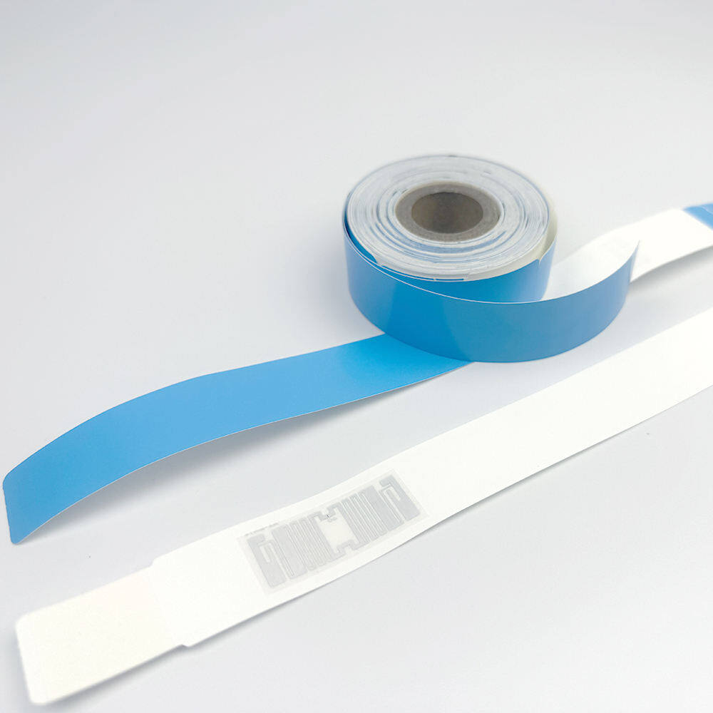
In the complex ecosystem of modern healthcare, few objects are as ubiquitous yet as frequently misunderstood as the color-coded wristband. Walk into any hospital in the United States and you will see them on nearly every patient's wrist: bright bands of pink, yellow, red, purple, and other hues that serve as visual shorthand for critical clinical information. These small strips of plastic or paper carry outsized responsibility, signaling allergies, fall risks, do-not-resuscitate orders, and other alerts that can mean the difference between safe care and catastrophic error.
A patient identification wristband is more than an accessory; it is a communication device embedded in the physical body of the patient. When designed and used correctly, it bridges gaps between shifts, departments, and disciplines, ensuring that vital safety information travels with the patient regardless of who is providing care at any given moment. The color-coding system was intended to make this communication instantaneous and universal, reducing reliance on memory and verbal handoffs that are notoriously prone to failure.
However, the history of color-coded wristbands reveals a tension between good intentions and practical execution. What began as a grassroots effort to improve patient safety has evolved into a patchwork of local customs, conflicting standards, and persistent misconceptions that continue to challenge healthcare organizations today. Understanding this history and its lessons is essential for anyone responsible for patient identification policy.
The Origins of a Safety Hazard
The modern concern over color-coded wristbands traces back to a specific and alarming incident. In 2005, a Pennsylvania hospital experienced a near-miss event in which a nurse almost administered a blood transfusion to the wrong patient because both patients were wearing identical yellow wristbands that had been assigned different meanings in different units. One unit used yellow to indicate fall risk; another used it to signal a latex allergy. The confusion was caught only by chance during a final verification step, but the potential consequences were severe enough to trigger a statewide investigation.
This near-miss was not an isolated anomaly. Subsequent surveys conducted by the Pennsylvania Patient Safety Authority revealed that hospitals across the state were using color-coded wristbands in wildly inconsistent ways. Yellow might mean fall risk in one facility and allergy alert in another. Red could signal DNR status in one hospital and infection precaution in the next. There was no common language, no shared dictionary of color meanings, and no mechanism to ensure that staff moving between facilities or responding to mutual aid calls would interpret the signals correctly.
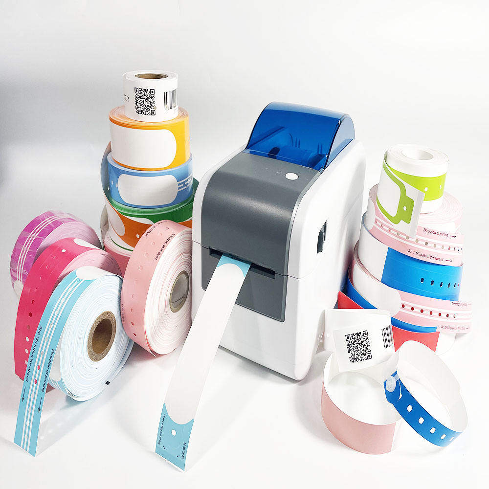
The implications were immediate and far-reaching. The investigation demonstrated that color alone, without standardized definitions, was not merely insufficient but actively dangerous. A system designed to reduce cognitive load and speed up recognition had instead introduced a new category of preventable error. Staff members who had worked at multiple facilities carried conflicting mental models of what each color meant, and temporary or traveling nurses had no reliable way to decode the local system.
Similar patterns emerged in other states as patient safety organizations began examining their own wristband practices. Reports from New Jersey, Ohio, and California documented comparable inconsistencies, suggesting that the Pennsylvania findings were symptomatic of a national problem rather than a local aberration. The absence of any authoritative national standard meant that each hospital was free to invent its own color scheme, often without formal documentation or staff training.
The fundamental problem was clear: color-coding had been adopted as a solution before the problem it was meant to solve had been properly defined. Hospitals had embraced the visual appeal of colored wristbands without establishing the governance structures necessary to make them safe. The result was a proliferation of well-intentioned but uncoordinated systems that created the illusion of safety while introducing new risks.
The Push for Standardization
In response to these findings, the American Hospital Association launched a voluntary standardization campaign in 2008. The AHA recommended a three-color system: yellow for fall risk, red for allergy, and purple for do-not-resuscitate status. This palette was deliberately limited to avoid the cognitive overload associated with larger sets and to align with colors already in widespread use. The recommendation was accompanied by guidance urging hospitals to adopt printed text on all wristbands so that color would serve as a secondary cue rather than the sole identifier.

The selection of purple for DNR status was particularly significant. Purple had already gained traction in several states as the preferred color for end-of-life directives, partly because it was visually distinct from the primary colors used for other alerts and partly because advocacy groups had promoted it through awareness campaigns. By codifying this emerging consensus, the AHA helped solidify a convention that reduced ambiguity across state lines.
The Food and Drug Administration reinforced these efforts by issuing guidance that encouraged manufacturers to produce wristbands conforming to the recommended color palette and to include printed alert text as a standard feature. While the FDA lacked regulatory authority to mandate specific colors, its endorsement lent credibility to the standardization movement and influenced procurement decisions at large health systems.
State-level initiatives complemented the national push. Several states passed legislation or issued regulations requiring hospitals to adopt standardized color-coding schemes, often based on the AHA recommendations but sometimes incorporating additional colors for locally prevalent concerns such as seizure risk or isolation precautions. These state laws created pockets of consistency within their jurisdictions but also introduced new variations between states.

Approximately thirty-five states have now adopted some form of standardized wristband color coding, though the degree of alignment with the original AHA recommendations varies considerably. Some states have adopted the three-color system exactly as proposed; others have expanded it to five or six colors to address additional clinical scenarios. The result is a landscape that is more consistent than it was two decades ago but still far from uniform.
Common Misunderstandings and Persistent Challenges
Despite widespread recognition of the need for standardization, several deeply ingrained misunderstandings continue to undermine the effectiveness of color-coded wristband systems. These misconceptions persist not because they are logically compelling but because they feel intuitively correct, making them resistant to correction through policy alone.
Misunderstanding 1: More Colors Means More Safety
A common assumption among clinicians and administrators is that expanding the color palette increases safety by encoding more information at a glance. If three colors are good, the reasoning goes, then six or eight must be better. This intuition leads facilities to add colors for conditions such as diabetes, seizure disorder, isolation status, difficult airway, and behavioral health concerns, creating a rainbow of wristbands that exceeds the capacity of human working memory.
Too many colors defeats the purpose of color-coding entirely. Research in cognitive psychology consistently shows that humans can reliably distinguish and recall only about four to seven categories of color under optimal conditions, and fewer under stress or time pressure. When a ward uses eight different wristband colors, staff members inevitably begin to confuse similar hues, forget less common assignments, or revert to asking colleagues rather than trusting the visual signal. The system that was meant to reduce cognitive load ends up increasing it.
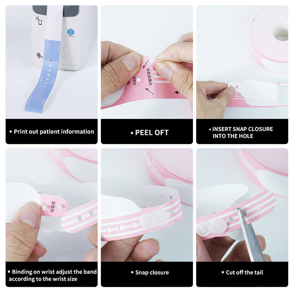
The principle that emerges from this evidence is counterintuitive but robust: restraint enhances safety. A limited palette of three to five colors, each with a clearly defined and universally understood meaning, provides more reliable communication than an expansive set that pushes the boundaries of human perception. Organizations that resist the urge to add colors often find that their existing system becomes more effective precisely because staff can trust it.
Misunderstanding 2: Color Alone Is Sufficient
The second persistent misunderstanding is the belief that the color of the wristband itself constitutes adequate communication. This view treats the wristband as a self-contained message rather than as one component of a layered identification strategy. It assumes that anyone who sees a yellow band will automatically know it means fall risk, regardless of whether they have received orientation to the local color scheme or whether the patient's chart confirms the assignment.
Best practice guidelines from organizations including The Joint Commission and the World Health Organization emphasize that color should always be supplemented with printed text. A wristband that reads "FALL RISK" in bold letters alongside its yellow background communicates effectively even to someone unfamiliar with the color convention, to a family member who notices the band and asks about it, or to a new employee still learning the system. Text transforms the wristband from a cryptic symbol into an explicit statement that can be verified against the medical record.
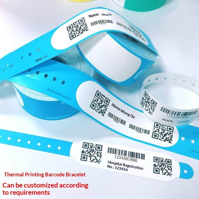
Handwriting on wristbands should be avoided whenever possible. Handwritten text is difficult to read, prone to smudging, and impossible to verify against a digital record. Thermal printing technology has made it feasible to produce wristbands with crisp, legible text and machine-readable barcodes at the point of admission, eliminating the need for manual annotation and ensuring that every band carries accurate, standardized information.
Misunderstanding 3: The Wristband Is the Only Identification Tool
The patient identification wristband plays a vital role in safety, but it is not sufficient on its own. Treating it as the sole mechanism for patient identification creates a single point of failure that can be compromised by damage, removal, contamination, or simple oversight. A faded band, a torn strap, or a wristband placed on an edematous limb that later swells and obscures the printed text can all render the device useless at the moment it is most needed.
The updated Patient Identification SAFER Guide from the Office of the National Coordinator for Health Information Technology recommends a multi-modal approach that combines wristbands with active verbal verification, electronic scanning, and chart review. The wristband serves as a persistent visual anchor, but positive identification should always involve at least two independent identifiers such as name and date of birth confirmed directly with the patient or a designated representative. Electronic scanning of barcoded wristbands adds a technological layer that catches mismatches before they reach the patient.
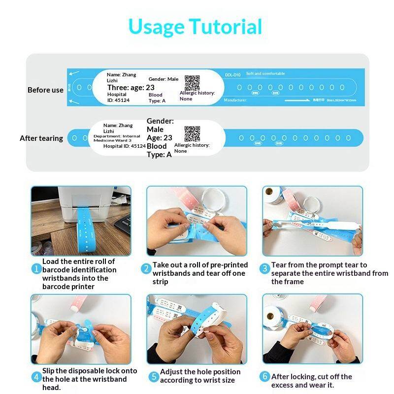
An ethnographically guided task analysis of wristband use in acute care settings has shown that staff members frequently bypass wristband checks when they believe they already know the patient, relying instead on room number, facial recognition, or informal notes. This shortcut works until it does not, typically during shift changes, transfers, or emergencies when familiarity gives way to uncertainty. Embedding wristband verification into mandatory workflows and electronic prompts helps sustain compliance even when individual vigilance wavers.
Misunderstanding 4: Wristbands Are Always Clean and Safe
Another persistent misunderstanding concerns the hygiene and material safety of wristbands themselves. Because wristbands are worn continuously and come into contact with skin, IV sites, and environmental surfaces, they can become vectors for pathogen transmission if not managed properly. Studies have documented bacterial colonization on reusable and cloth wristbands, particularly in high-acuity units where patients have compromised immune systems or open wounds.
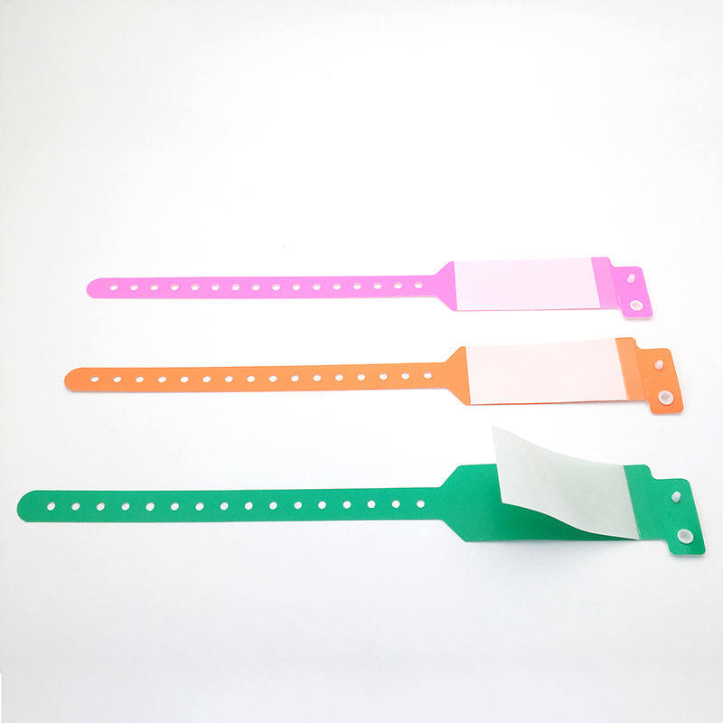
The proximity of the wristband to intravenous access sites makes infection control especially critical. A contaminated wristband resting against a fresh IV insertion point can introduce pathogens directly into the bloodstream. Single-use, disposable wristbands made from non-porous materials such as vinyl or coated paper reduce this risk significantly compared to reusable fabric bands. Facilities should establish policies requiring wristband replacement when bands become soiled, damaged, or saturated with moisture, and should audit compliance regularly.
Misunderstanding 5: Standardization Is a Solved Problem
The most dangerous misunderstanding is the complacent belief that standardization has been achieved and requires no further attention. While progress has been made since the 2005 Pennsylvania incident, significant variation persists both within and between countries. New staff members arrive without knowledge of local conventions, mergers bring together facilities with incompatible systems, and supply chain disruptions force substitutions that may not match established palettes.
Some facilities have developed elaborate local color schemes that diverge substantially from national recommendations, justified by the argument that their patient population or clinical mix requires special handling. While local adaptation is sometimes necessary, it should be undertaken with full awareness of the trade-offs involved. Every departure from a recognized standard increases the risk of miscommunication during inter-facility transfers, disaster response, or staff rotation.
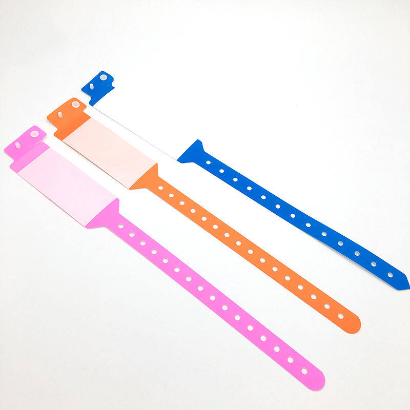
International variation adds another layer of complexity. Countries outside the United States have developed their own color conventions, sometimes aligned with AHA recommendations and sometimes entirely independent. Healthcare professionals who work across borders or treat international patients must navigate multiple systems simultaneously, underscoring the need for text-based identification that transcends color alone.
Moving Toward Safer Practice
For healthcare organizations seeking to improve their wristband practices, the evidence supports a set of concrete, actionable steps that balance standardization with practical flexibility. These recommendations draw on decades of patient safety research, cognitive science, and frontline experience.
First, limit the number of colors to a manageable set. Three to five colors is the optimal range for most acute care facilities. Each color should have a single, unambiguous meaning documented in institutional policy and communicated to all staff during orientation and annual competency assessments. Resist the temptation to add colors for rare or situational alerts; these are better handled through chart flags, electronic notifications, or verbal handoffs.
Second, require text on all colored bands. Every wristband should carry printed text stating its meaning in plain language. This requirement applies regardless of whether the facility uses a standardized color palette or a locally adapted one. Text ensures that the wristband communicates effectively to anyone who encounters it, including staff from other facilities, emergency responders, and family members.

Third, restrict application to trained personnel. Wristband placement should be performed only by staff who have completed documented training in proper sizing, positioning, and verification procedures. Incorrectly applied bands that are too tight, too loose, or placed over dressings compromise both safety and comfort. Regular audits of application technique help maintain standards.
Fourth, prohibit community wristbands in clinical areas. Awareness ribbons, charity bands, and personal jewelry worn on the same wrist as clinical identification bands create visual noise that can obscure or be confused with safety signals. Clear policies distinguishing clinical from personal wristbands reduce this risk.
Fifth, maintain consistency across the organization. Multi-hospital systems should adopt a single, system-wide color palette rather than allowing individual facilities to develop independent schemes. Consistency simplifies training, reduces errors during transfers, and strengthens the reliability of the visual communication system.
Finally, address the infection control dimension explicitly. Wristband policies should specify material requirements, replacement criteria, and cleaning protocols. Single-use disposable bands made from non-porous materials should be the default in acute care settings. Staff should be empowered to replace soiled or damaged bands immediately without waiting for administrative approval.
Conclusion: Clarity Through Constraint
The color-coded wristband offers a powerful example of how simplicity, when properly governed, can enhance safety in complex environments. Its effectiveness depends not on the number of colors deployed but on the clarity of the conventions that give those colors meaning. A small, well-defined palette backed by printed text, trained staff, and consistent policies communicates more reliably than an expansive but poorly coordinated system.
The standardization efforts that followed the 2005 Pennsylvania near-miss have produced meaningful improvements in patient safety, but the work is not complete. Persistent misunderstandings about color quantity, sufficiency, exclusivity, hygiene, and completion continue to challenge healthcare organizations. Addressing these misconceptions requires ongoing education, regular auditing, and a willingness to simplify rather than elaborate.
For healthcare professionals, the takeaway is clear: respect the wristband as a tool, not a talisman. Use it as part of a layered identification strategy that includes verbal verification, electronic scanning, and chart review. Ensure that every band carries legible text. Limit your palette to what your team can reliably remember. And never assume that standardization is a destination rather than a discipline.
The patient identification wristband is a simple object with profound implications. When we get it right, it quietly protects patients and supports clinicians in doing their best work. When we get it wrong, it introduces the very hazards it was meant to prevent. The difference lies not in the plastic or the ink but in the thoughtfulness with which we design, implement, and sustain the systems that give these small bands their meaning.
Have Questions About Wristbands?
Our team is ready to help you find the perfect wristband solution for your needs. Contact us directly on WhatsApp for quick responses.
Contact on WhatsApp