
For Safety's Sake: How Color-Coded Medical Wristbands Fast-Track Risk Communication
In the high-stakes, high-speed environment of modern healthcare, the margin between a safe outcome and a catastrophic error is often measured in seconds. Clinicians must process an enormous volume of patient-specific information — allergies, fall risks, code status, restricted limbs — while simultaneously managing complex treatment protocols, coordinating with multidisciplinary teams, and responding to rapidly changing clinical conditions. In this context, any tool that can deliver critical safety information at a glance, without requiring the clinician to open a chart, log into a computer, or decipher handwritten notes, has the potential to save lives.
Color-coded medical wristbands represent one such tool. These simple, visually distinct bands serve as an immediate, passive communication system that conveys essential patient safety alerts directly at the point of care. When a nurse approaches a bedside, the color of the wristband provides instant recognition of key risk factors before any verbal exchange or electronic query occurs. This visual shorthand reduces cognitive load, accelerates decision-making, and creates a redundant layer of protection against the miscommunication and information gaps that drive preventable medical errors.
However, the implementation of these systems is not without controversy. Variability in color conventions across facilities, regions, and countries has created confusion rather than clarity in some cases. The absence of universal standards means that a red wristband signaling "allergy" in one hospital might indicate "fall risk" in another, potentially introducing new hazards even as it seeks to mitigate existing ones. The ongoing effort to standardize color-coded wristband protocols reflects a broader tension in healthcare safety: the need to balance local flexibility with systemic consistency, and the challenge of translating well-intentioned safety innovations into reliable, universally understood practice.
The Silent Language of Healthcare
Medical wristbands have evolved from simple identification tags into sophisticated communication devices. While their primary function remains positive patient identification — ensuring that the right patient receives the right treatment at the right time — the addition of color coding has transformed them into a parallel channel for conveying critical safety information. This visual language operates continuously, requiring no battery, no network connection, and no user interaction. It is always on, always visible, and always available to any member of the care team who glances at the patient's wrist. In an era of increasing technological complexity, there is profound value in a safety mechanism that is irreducibly simple.
The Standardized Palette
The American Hospital Association (AHA) has advocated for a standardized color scheme to promote consistency across healthcare facilities. While adoption remains voluntary and incomplete, the following color conventions have gained widespread acceptance in the United States:
Red: The Allergy Alert. A red wristband signals that the patient has a documented allergy, most commonly to medications such as penicillin, sulfa drugs, or contrast dyes, but also to latex, foods, or environmental substances. The red color leverages its universal association with danger and stopping to create an immediate pause response in clinicians preparing to administer medications or perform procedures. This visual alert does not replace the mandatory verification of allergy details in the medical record, but it serves as a critical first-line warning that prompts the clinician to check before proceeding. In emergency situations where time is compressed and multiple providers are involved, the red band can prevent the administration of an allergen before the full chart review is complete, potentially averting anaphylaxis.
Yellow: The Fall Risk Indicator. Yellow wristbands identify patients who have been assessed as being at elevated risk for falls. Falls are among the most common adverse events in hospitalized patients, resulting in fractures, head injuries, increased length of stay, and significant psychological distress. The yellow band alerts all staff members — not just the primary nursing team — that this patient requires enhanced supervision, assistance with ambulation, and adherence to fall prevention protocols. Environmental services staff, transport personnel, and visiting consultants who may not be familiar with the patient's specific risk assessment can immediately recognize the need for caution. The bright, attention-grabbing color ensures visibility even in dimly lit rooms or during nighttime rounds.
Purple: The DNR Protocol. A purple wristband indicates that the patient has a Do Not Resuscitate (DNR) order or other limitations on resuscitative measures. This is perhaps the most ethically sensitive application of color coding, as it communicates end-of-life care preferences that must be respected even in moments of acute crisis. When a patient codes, the presence of a purple band provides immediate visual confirmation of the patient's wishes, preventing unwanted and potentially traumatic resuscitation attempts. The choice of purple is deliberate: it is distinct from the more common alert colors and carries cultural associations with dignity and solemnity appropriate to the gravity of the information it conveys.
Pink: The Restricted Extremity. Pink wristbands are used to identify patients who have restrictions on blood pressure measurements, IV insertions, or blood draws on a particular arm. This is most commonly seen in patients who have had lymph node dissection related to breast cancer treatment, those with arteriovenous fistulas for dialysis, or patients with existing vascular compromise. Performing procedures on a restricted limb can cause lymphedema, damage to the fistula, or other serious complications. The pink band serves as a constant reminder to phlebotomists, nurses, and anesthesia providers to use the contralateral extremity or alternative sites.
Green: The Latex Allergy. Some facilities use green wristbands specifically to denote latex allergy, distinguishing it from other drug or food allergies signaled by red. Given the prevalence of latex sensitivity in both patients and healthcare workers, and the ubiquity of latex-containing medical supplies, this dedicated color provides an additional layer of specificity. However, not all facilities adopt this convention, and many fold latex allergy into the general red allergy category.
Beyond the Basics: Specialized Alerts
Beyond the core AHA-recommended colors, individual facilities have developed additional color conventions to address specific clinical needs. Blue wristbands may indicate asthma or respiratory precautions. Orange bands sometimes signal behavioral health concerns or elopement risk. White bands have been used to denote hearing impairment or communication difficulties. These extensions reflect the creativity of frontline clinicians seeking to solve local safety problems, but they also underscore the risks of non-standardization: when colors mean different things in different places, the system breaks down at transfer points, during disaster response, and when traveling healthcare workers move between facilities.
The proliferation of facility-specific color codes has led some institutions to abandon color coding entirely, arguing that the potential for misinterpretation outweighs the benefits. Others have doubled down on standardization efforts, implementing strict policies that limit wristband colors to the AHA-recommended palette and prohibit the use of non-standard colors. The debate highlights a fundamental principle of safety engineering: a signaling system is only as reliable as the shared understanding of its meaning. Without consensus, even well-designed tools become sources of error.
The Cognitive Rationale: Reducing the Brain's Workload
The effectiveness of color-coded wristbands is rooted in cognitive science. Human visual processing is exceptionally fast and efficient: the brain can extract color information from a visual scene in approximately 13 milliseconds, far faster than it can read text, interpret symbols, or navigate an electronic interface. This speed advantage makes color an ideal medium for conveying time-critical safety information in environments where every second counts.
Color coding also exploits the brain's capacity for parallel processing. While reading a chart requires sequential attention — scanning lines of text, parsing abbreviations, integrating information across multiple screens — color perception occurs pre-attentively, meaning it registers automatically without conscious effort. A clinician walking past a patient's bed absorbs the color signal without deliberately looking for it, maintaining situational awareness even when focused on other tasks. This passive monitoring capability is particularly valuable during handoffs, rounds, and emergency responses when attention is divided among multiple competing demands.
Furthermore, color coding reduces working memory burden. Instead of holding multiple patient-specific risk factors in mind while performing a procedure, the clinician can offload this cognitive work onto the physical environment. The wristband serves as an external memory aid, keeping critical information persistently visible and reducing the likelihood that fatigue, distraction, or task switching will cause important safety alerts to be forgotten. Research in human factors engineering consistently demonstrates that externalizing information in this way significantly reduces error rates in high-complexity, high-stress domains.
The Danger of Non-Standardization
The case for standardization is best illustrated by examining what happens in its absence. Prior to the AHA's standardization campaign, surveys revealed alarming variability in wristband color meanings across U.S. hospitals. One study found that red wristbands signified allergy in only 60% of facilities; in others, red indicated fall risk, DNR status, or even "do not disturb." Yellow was equally inconsistent, variously representing fall risk, isolation precautions, or palliative care. This patchwork of local conventions created a dangerous landscape where healthcare professionals could not reliably interpret wristband colors outside their own institution.
The consequences of this inconsistency extend beyond theoretical risk. Patient transfers between facilities, temporary staffing assignments, disaster deployments, and inter-facility consultations all create scenarios where clinicians encounter unfamiliar wristband color conventions. In these moments of transition, the very tool designed to enhance safety becomes a source of ambiguity. A nurse floating from one unit to another, a locum tenens physician covering a shift at an unfamiliar hospital, or an EMT receiving a patient from a transferring facility may misinterpret a color signal, leading to delayed care, inappropriate interventions, or failure to honor patient wishes. Standardization eliminates this translation problem by establishing a common visual vocabulary that transcends institutional boundaries.
The Anatomy of a Medical Wristband
Understanding the physical design of modern medical wristbands illuminates how color coding integrates with other identification and safety features to create a comprehensive patient safety system.
Material and Wearability
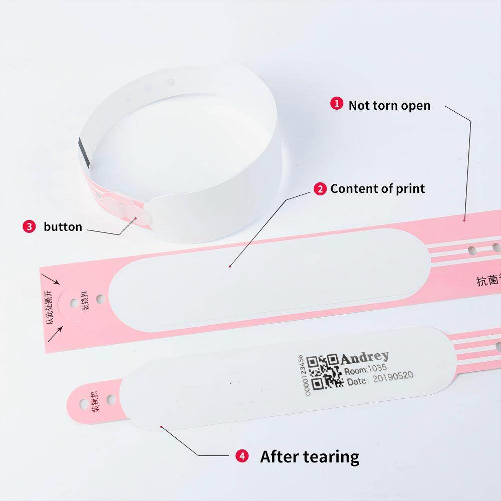
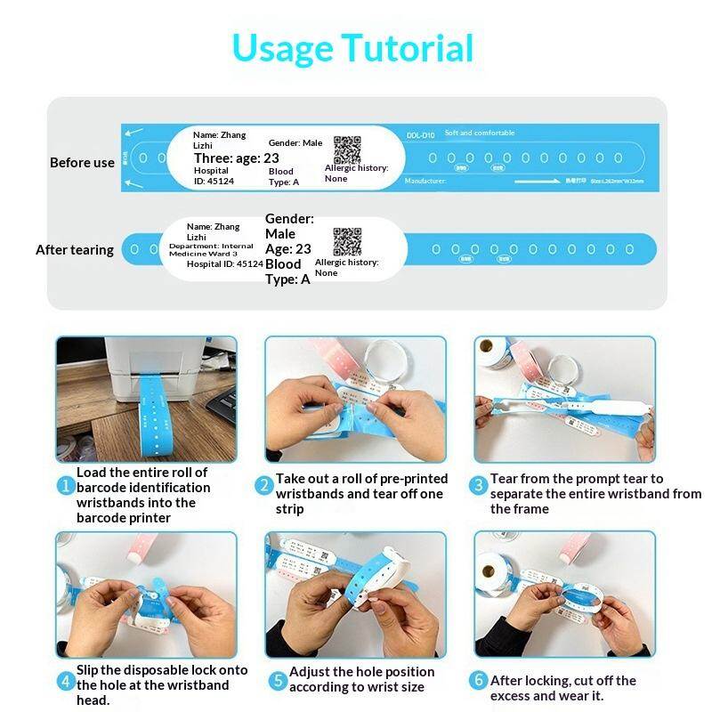
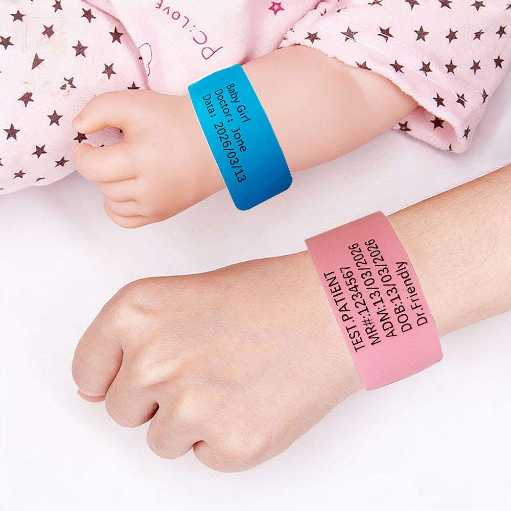
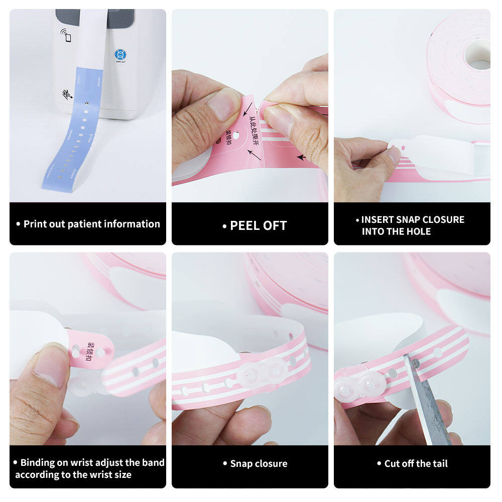
Contemporary medical wristbands are typically manufactured from soft, flexible synthetic materials such as polyethylene, vinyl, or thermoplastic elastomers. These materials are selected for durability, water resistance, skin compatibility, and print receptivity. The bands must withstand exposure to soap, alcohol-based sanitizers, bodily fluids, and repeated friction against bedding and clothing without degrading, fading, or causing skin irritation. Latex-free construction is now standard to prevent allergic reactions. The closure mechanism — typically a tamper-evident snap, adhesive tab, or plastic clip — ensures that the band cannot be removed and reapplied without visible evidence of tampering, preserving the integrity of the identification chain.
Text and Barcodes
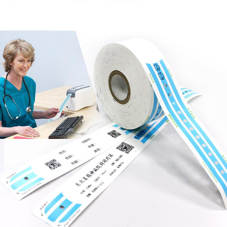
While color provides an immediate visual alert, it is never sufficient on its own. Every medical wristband also carries printed text identifying the patient by name and medical record number, along with a barcode or QR code that links to the electronic health record. This layered approach ensures that the color signal triggers awareness while the printed and scannable data enables positive identification and access to detailed clinical information. The combination of color, text, and machine-readable code creates three independent verification channels, each reinforcing the others.
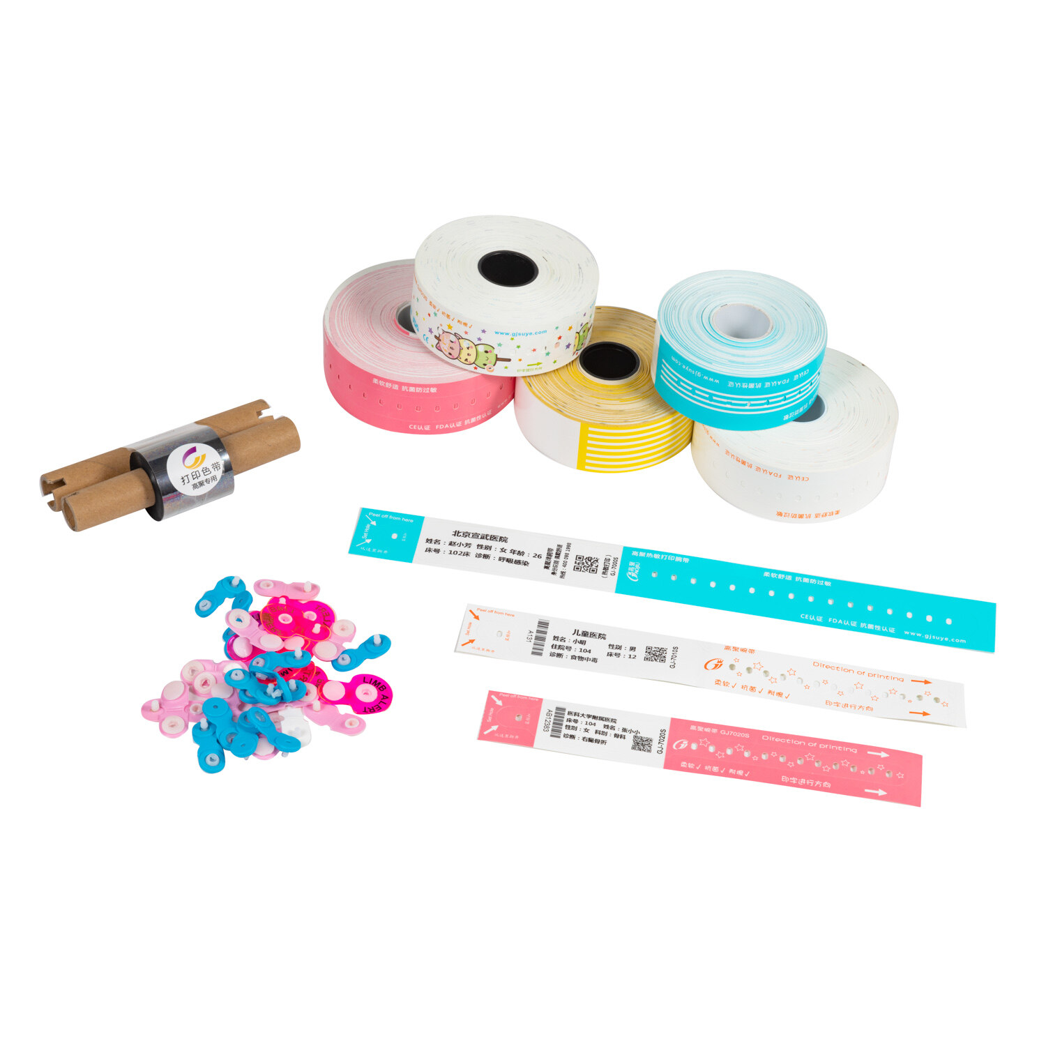
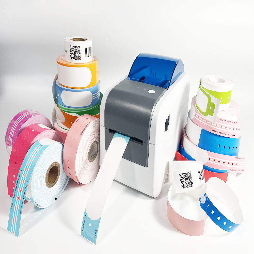
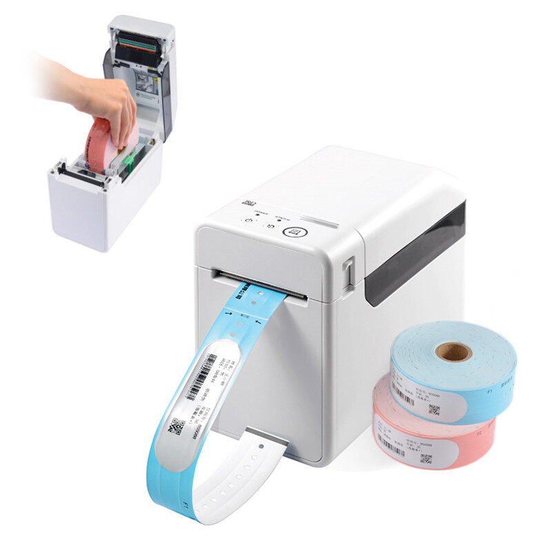
Thermal printing technology has become the dominant method for producing patient-specific wristbands at the point of care. Direct thermal printers require no ink or toner, produce sharp, smudge-resistant text and barcodes, and can print on demand in seconds. This capability supports real-time wristband generation at admission, eliminating the delays and errors associated with pre-printed or centrally produced bands. Modern thermal wristband printers are compact enough to fit on nursing station desks or mobile carts, bringing wristband production directly to the bedside and supporting immediate replacement when bands become damaged or soiled.
The integration of QR codes alongside traditional linear barcodes has expanded the functionality of wristband-based identification. QR codes can encode more data in a smaller space and can be scanned by standard smartphones and tablets, enabling rapid access to patient information in settings where dedicated barcode scanners may not be available. Some systems embed encrypted URLs in QR codes that link directly to the patient's electronic health record, streamlining the workflow for clinicians who need quick access to allergy lists, medication orders, or code status documentation.
The AHA Standardization Effort
In 2008, the American Hospital Association launched a voluntary standardization initiative recommending four standardized wristband colors: red for allergy, yellow for fall risk, purple for DNR, and pink for restricted extremity. The initiative was motivated by patient safety incidents attributed to inconsistent color coding and by growing recognition that a national standard would improve interoperability and reduce errors during care transitions. The AHA complemented the color recommendations with best practices for wristband implementation.
The recommended best practices include:
- Use wristbands with the alert message pre-printed. Color alone is insufficient; the wristband should also display the specific alert (e.g., "ALLERGY," "FALL RISK," "DNR") in clear, legible text. This redundancy ensures that the message is conveyed even to individuals who are colorblind, unfamiliar with the color convention, or viewing the band under poor lighting conditions.
- Remove "social cause" colored wristbands. Colored wristbands worn for awareness campaigns (e.g., pink for breast cancer, yellow for military support) can interfere with clinical color coding. Facilities should request that patients remove these bands upon admission or cover them with a white band to prevent confusion with safety-alert colors.
- Remove wristbands applied from another facility. Because color conventions may differ between institutions, wristbands from transferring facilities should be removed and replaced with the receiving facility's standardized bands after verifying the underlying clinical information. This practice prevents misinterpretation of legacy color signals.
- Educate patients and families. Patients and their families should be informed about the meaning of each wristband color and encouraged to speak up if they notice a discrepancy. Engaging patients as active participants in the safety system adds another layer of verification and reinforces the culture of transparency and shared responsibility.
Case Study: The Fall Risk Paradox
Fall risk identification illustrates both the promise and the complexity of color-coded wristband systems. Falls remain one of the most prevalent and costly adverse events in hospitalized patients, affecting approximately 700,000 to 1 million patients annually in the United States alone. Despite decades of prevention efforts, fall rates have proven stubbornly resistant to improvement, in part because fall risk is dynamic: a patient assessed as low risk at admission may become high risk after receiving sedating medications, experiencing a change in mental status, or undergoing surgery.
The yellow wristband serves as a persistent, visible reminder of fall risk that survives shift changes, provider rotations, and care transitions. However, research has identified a paradoxical effect: in some settings, the universal application of yellow wristbands to all patients above a certain risk threshold has led to "alert fatigue," where staff become desensitized to the color signal because it appears on a large proportion of patients. This phenomenon underscores the importance of judicious application: color coding is most effective when it identifies genuinely elevated risk rather than serving as a default for broad patient categories. Regular reassessment and timely removal of wristbands when risk factors resolve are essential to maintaining the signal's salience and credibility.
The Vendor Landscape and Implementation
The medical wristband market encompasses a diverse ecosystem of manufacturers, distributors, and technology providers. Leading vendors offer comprehensive solutions that integrate wristband materials, thermal printers, software interfaces, and consumable supplies into unified patient identification platforms. When selecting a wristband system, healthcare facilities must consider multiple factors beyond color availability.
- Patient wristband sizes: Adult, pediatric, neonatal, and bariatric sizes ensure proper fit for all patient populations. Ill-fitting bands compromise both comfort and security.
- Patient wristband colors: Availability of standardized colors (red, yellow, purple, pink) plus identification colors (white, blue) in consistent, distinguishable shades that maintain their appearance throughout the wear period.
- Security wristbands: Tamper-evident closure mechanisms that provide visible evidence of removal or tampering, preventing unauthorized band transfer or substitution.
- Waterproof medical wristbands: Materials and printing technologies that maintain legibility and structural integrity through bathing, swimming, and exposure to clinical fluids and cleaning agents.
This is where medical wristband design intersects with hospital safety. The physical properties of the wristband — its material, closure, print quality, and color fidelity — directly determine whether the identification and alert systems function reliably in real-world clinical conditions. Procurement decisions about wristband supplies are, in essence, patient safety decisions that deserve the same rigorous evaluation applied to pharmaceuticals, medical devices, and clinical protocols.
The 2026 Reality: Standardization Progress vs. Resistance
Nearly two decades after the AHA's standardization initiative, progress has been substantial but incomplete. Surveys indicate that a majority of U.S. hospitals have adopted at least some elements of the recommended color palette, and several state hospital associations have made standardization a condition of membership or accreditation. International adoption has been slower, with countries like the UK, Canada, and Australia developing their own national guidelines that partially align with but do not fully replicate the AHA recommendations.
Resistance persists for several reasons. Some facilities argue that their established local color conventions are deeply embedded in staff training and institutional culture, and that transitioning to a national standard would require costly retraining and temporary increases in error risk during the changeover period. Others contend that the AHA palette does not adequately address their specific clinical needs, such as behavioral health alerts, isolation precautions, or research protocol identifiers. Still others question whether color coding adds meaningful safety value beyond electronic health record alerts, barcode scanning, and verbal handoff protocols, arguing that resources would be better invested in improving these existing systems.
The most productive path forward likely involves integration rather than competition. Color-coded wristbands are most effective not as standalone safety mechanisms but as complementary layers within a multi-modal identification and alert system. When color signals, printed text, barcode verification, electronic alerts, and verbal communication all convey consistent information through independent channels, the probability of any single failure mode causing harm drops dramatically. The goal is not to choose between technological and analog safety tools but to design systems in which each reinforces the others, creating resilience through redundancy.
The Role of the Patient and Family
Patients and families are essential partners in the color-coded wristband safety system. Educating patients about the meaning of their wristband colors empowers them to participate actively in their own safety, asking questions when they notice inconsistencies and alerting staff to potential errors. Family members who understand the color system can serve as additional observers, particularly for patients who are sedated, confused, or otherwise unable to advocate for themselves. Some facilities provide printed cards or brochures explaining the wristband color system as part of the admission process, reinforcing verbal education and creating a reference that families can consult throughout the hospital stay.
Challenges and Considerations
Implementing and maintaining an effective color-coded wristband system requires ongoing attention to several operational challenges:
- Compatibility: Wristband materials must be compatible with the facility's thermal printers, sanitizers, and clinical workflows. Incompatibilities can lead to faded print, premature band degradation, or scanner failures that undermine the entire system.
- Dual Facilities: Health systems operating multiple facilities must decide whether to adopt uniform color conventions across all sites or permit local variation. Uniformity simplifies staff rotation and patient transfers but may require some facilities to abandon established local practices.
- Misinterpretation: Color blindness affects approximately 8% of males and 0.5% of females of Northern European descent. Facilities must ensure that color is never the sole means of conveying safety information and that printed text or symbols provide equivalent accessibility for color-vision-deficient staff.
- Removal and Replacement: Protocols for timely removal of wristbands when risk factors resolve and replacement when bands become damaged or illegible are critical to maintaining system accuracy. Outdated or degraded wristbands erode trust in the color coding system and increase the risk of both false reassurance and unnecessary alarm.
Future of Patient Identification
Emerging technologies promise to expand the capabilities of wristband-based patient identification and safety alerting. RFID-enabled wristbands can transmit patient identity and alert information wirelessly to nearby readers, enabling automated location tracking, access control, and real-time status updates without requiring line-of-sight scanning. Smart wristbands incorporating biosensors could monitor vital signs, detect falls, or alert staff to physiological deterioration, transforming the wristband from a passive identifier into an active monitoring device. Integration with artificial intelligence and predictive analytics could enable dynamic risk stratification, automatically updating wristband alerts as patient conditions change. However, these technological advances will not eliminate the need for simple, reliable, universally understood visual signals. The color-coded wristband's enduring value lies in its independence from infrastructure, its immunity to network outages and software bugs, and its ability to communicate instantly to any human observer regardless of technological literacy or equipment availability.
Conclusion
Color-coded medical wristbands occupy a unique position in the patient safety landscape. They are simultaneously one of the simplest and most sophisticated tools available to healthcare providers: simple in their physical form and operation, sophisticated in their integration of cognitive science, human factors engineering, and clinical risk management. When properly implemented with standardized colors, printed text, and complementary electronic systems, they provide a continuous, passive, and universally accessible layer of safety alerting that no other technology can replicate.
The journey toward universal standardization is far from complete, and legitimate debates continue about the optimal scope, enforcement, and integration of color-coded wristband systems. What is beyond debate is the fundamental principle that drives their adoption: in the complex, time-pressured, and inherently risky environment of modern healthcare, every second saved in recognizing a critical patient safety factor is a second gained for appropriate action. Every error prevented by a glance at a colored band is a life protected, a family spared, and a step closer to the zero-harm culture that healthcare aspires to achieve.
For healthcare leaders, clinicians, and patients alike, the message of the color-coded wristband is clear: safety is not solely a matter of advanced technology, elaborate protocols, or extensive training. It is also, and fundamentally, a matter of making critical information visible, immediate, and unmistakable. In the silent language of color, spoken at the bedside in a fraction of a second, lies one of healthcare's most powerful defenses against the errors that threaten us all.
Continue Reading
Have Questions About Wristbands?
Our team is ready to help you find the perfect wristband solution for your needs. Contact us directly on WhatsApp for quick responses.
Contact on WhatsApp