
The Pink Trap: How Color-Coded Wristbands Create Cultural Confusion and Patient Safety Hazards
Introduction: When Color Speaks Different Languages
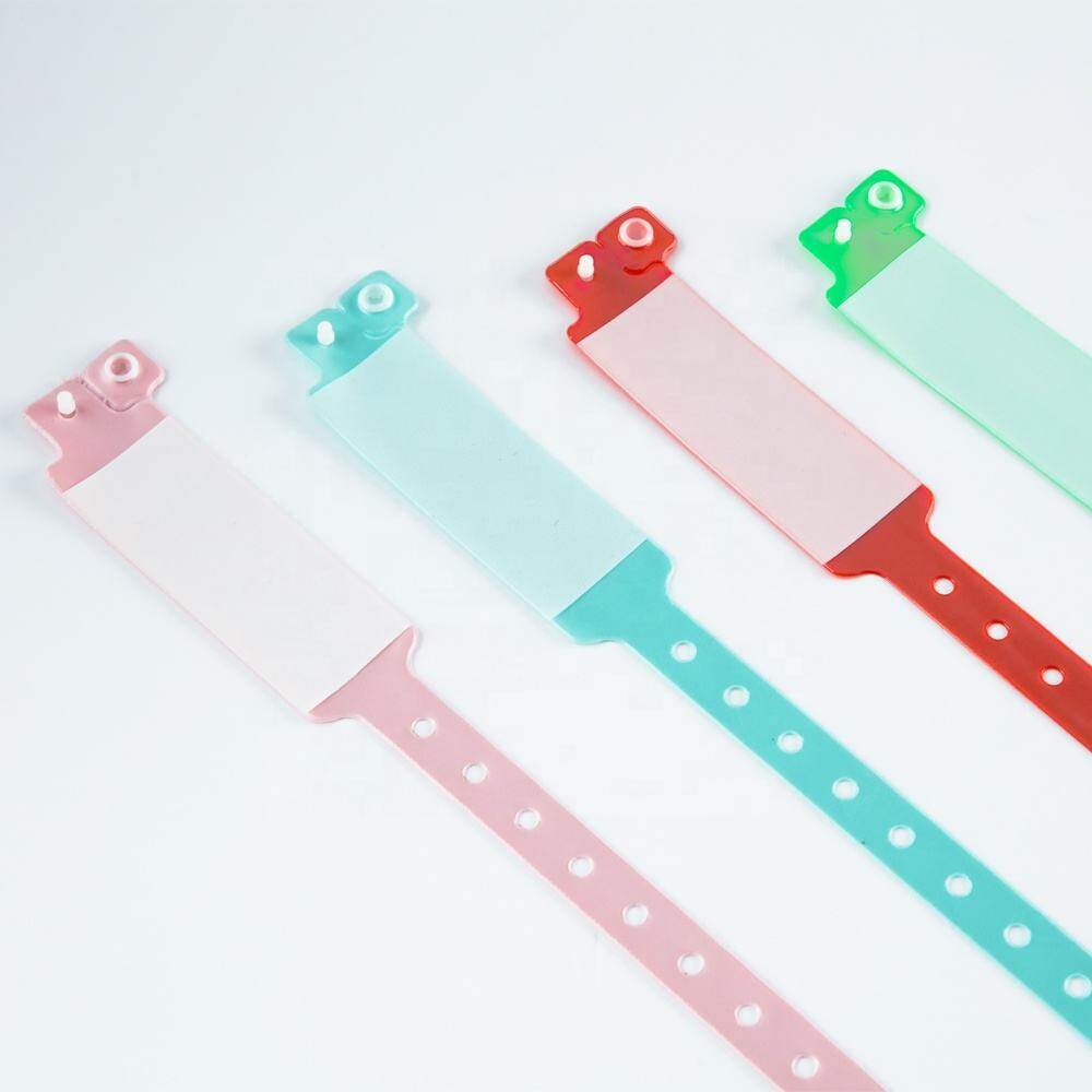
Walk into any hospital ward and you will see them: thin bands of color wrapped around patients' wrists, each hue carrying an urgent clinical message. Red means allergy. Yellow means fall risk. Purple means do not resuscitate. The system seems elegant in its simplicity—a visual shorthand that allows nurses, physicians, and ancillary staff to grasp critical safety information at a glance without fumbling through charts or waiting for electronic records to load.
Yet this chromatic language is far from universal. A pink wristband that signals "restricted extremity" in one American hospital may indicate "infant abduction risk" in another, or simply denote a female patient in a third. Across national borders, the confusion multiplies: white signifies mourning in parts of East Asia, while red conveys prosperity rather than danger. Even within a single facility, temporary staff, traveling nurses, and newly rotated residents may interpret colors through the lens of their previous institution's protocol—or through cultural associations formed long before they entered healthcare.
The stakes are not academic. Misread wristband colors have contributed to wrong-site surgeries, missed allergy alerts, and delayed emergency responses. As healthcare systems grow more diverse and mobile, relying on color alone becomes not just unreliable but actively dangerous. This article traces the origins of color-coded wristband systems, examines where they break down, and argues that text and symbols must serve as the primary safety layer—with color relegated to a supplementary cue.

The False Promise of Universal Color Language
The idea that color can function as a universal clinical language rests on an assumption that human color perception is both consistent and shared. Neither assumption holds up under scrutiny.
Color Perception Is Culturally Constructed
Anthropologists and linguists have long documented that color categories are not hardwired but learned. Different languages carve up the visible spectrum in radically different ways, and these linguistic frameworks shape how people perceive, remember, and react to color in real time.
- Red: In Western clinical settings, red universally signals danger or allergy. In Chinese culture, red is the color of celebration, luck, and prosperity—associations that can subtly dampen the urgency response among staff or family members raised in that tradition.
- White: Western hospitals use white for general identification or "no special alert." In many East Asian cultures, white is the color of mourning and death, potentially triggering anxiety in patients and families when used on a wristband.
- Purple: In the United States, purple has been adopted for DNR (Do Not Resuscitate) status. In Thailand, purple is associated with mourning and is worn by widows. In Brazil, purple is linked to Lent and religious penitence. None of these associations map cleanly onto end-of-life care decisions.
- Green: Green typically signals "safe" or "all clear" in Western contexts. In some Middle Eastern cultures, green carries sacred religious significance, making its casual clinical use potentially disrespectful or distracting.
The "Community Wristband" Problem
Beyond cultural variation lies a more mundane but equally dangerous source of confusion: non-clinical wristbands that mimic hospital alert bands. Awareness campaigns, charity events, and fashion trends have popularized colored silicone and vinyl wristbands in every hue of the clinical spectrum. A patient arriving at the emergency department wearing a pink breast cancer awareness band may be mistakenly flagged for restricted-extremity protocols. A yellow Livestrong-style band could trigger unnecessary fall-prevention measures. Staff cannot reliably distinguish between a medical alert device and a personal accessory without reading text—and if the wristband lacks text, the ambiguity is irresolvable.
Color Blindness: The Silent Vulnerability
Even if cultural variation were eliminated overnight, color-coded wristband systems would still fail for a significant portion of the clinical workforce.
Prevalence and Clinical Impact
Approximately 8% of males and 0.5% of females of Northern European descent have some form of color vision deficiency (CVD). The most common type, deuteranomaly (reduced sensitivity to green light), makes red and green appear similar or indistinguishable. Protanopia (absence of red cone function) and tritanopia (blue-yellow confusion) are rarer but equally disruptive in a clinical color-coding context.
In a typical hospital with 500 clinical staff, roughly 40 individuals may have some degree of CVD. These clinicians cannot reliably differentiate the very colors that form the backbone of wristband alert systems. They must rely on secondary cues—text labels, symbols, or verbal confirmation—every single time. If those secondary cues are absent, the color-coded system provides them with no actionable information whatsoever.
A 2005 Incident That Changed the Conversation
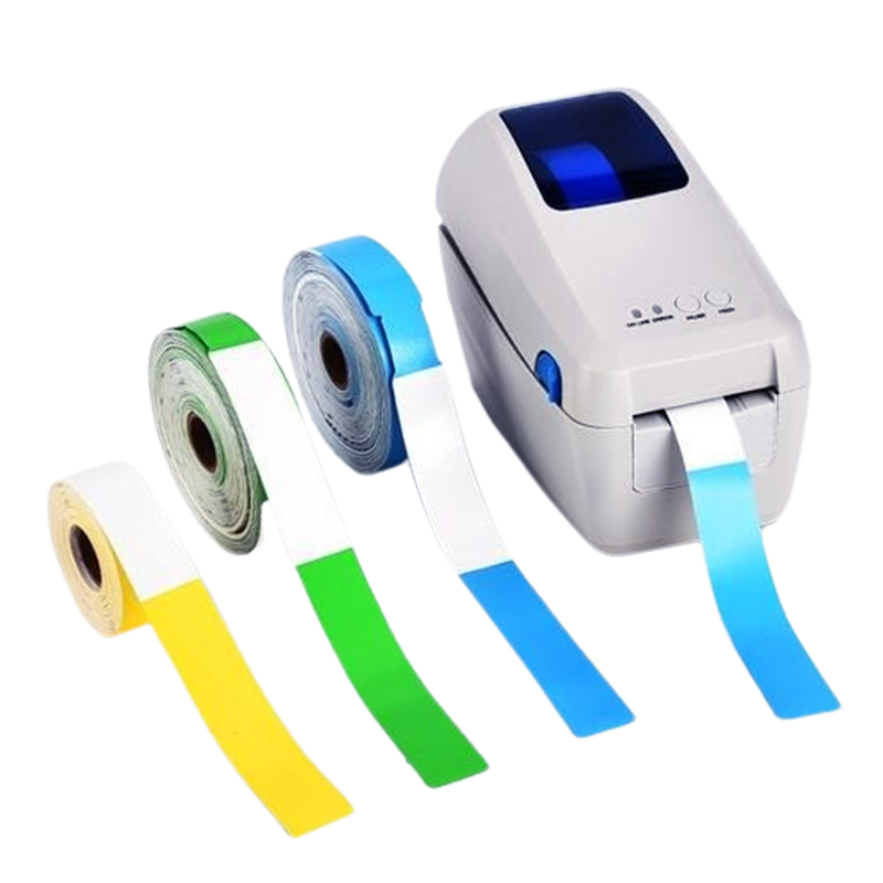
The abstract risks of color-only wristband systems became terrifyingly concrete in 2005, when a Pennsylvania hospital reported a near-miss that sent shockwaves through the patient safety community. A nurse, relying on a color-coded wristband system that differed from her previous employer's protocol, misidentified a patient's allergy status. The patient nearly received a contraindicated medication. Only a last-minute verbal check prevented a fatal error.
This incident was not an outlier. The Pennsylvania Patient Safety Reporting System (PA-PSRS) subsequently identified multiple reports of wristband-related confusion, prompting the state's Patient Safety Authority to issue an advisory recommending standardized color coding. The case demonstrated what patient safety researchers had long suspected: when color is the sole carrier of critical information, the system is only as reliable as the observer's ability to perceive and correctly interpret that color—an ability that varies across individuals, cultures, lighting conditions, and fatigue levels.
The Case for Standardization: Progress and Resistance
In response to incidents like the Pennsylvania near-miss, professional organizations have attempted to impose order on the chromatic chaos.
The AHA Recommendations
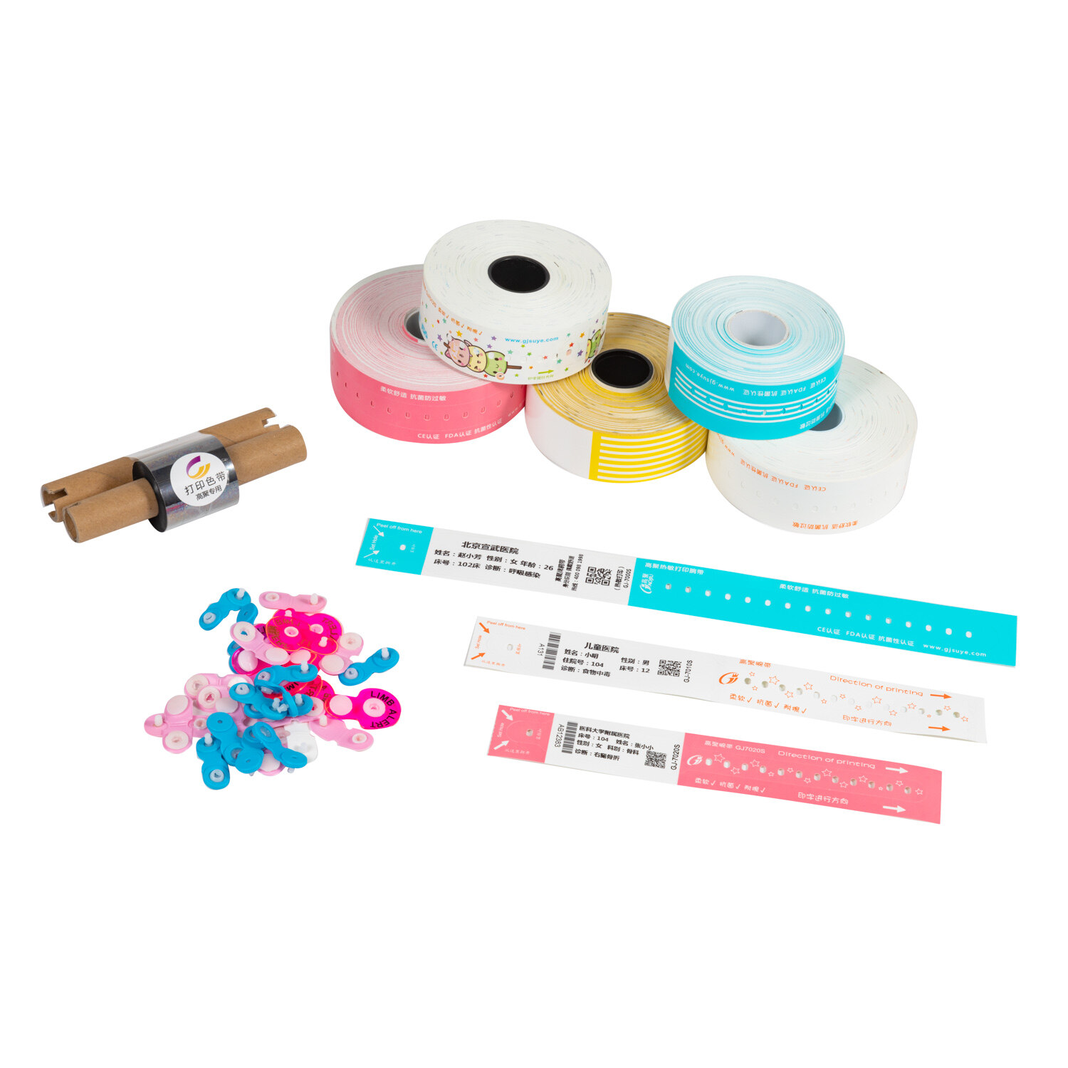
The American Hospital Association (AHA), in collaboration with state hospital associations and patient safety organizations, developed a voluntary standardized color-coding framework:
- Red: Allergy — signals that the patient has a documented drug, food, or environmental allergy requiring verification before any administration.
- Yellow: Fall risk — indicates the patient requires fall-prevention protocols, including bed alarms, non-slip footwear, and assisted ambulation.
- Pink: Restricted extremity — identifies a limb where blood draws, IV insertion, or blood pressure measurements should be avoided due to lymphedema risk, fistula presence, or surgical site protection.
- Purple: DNR (Do Not Resuscitate) — communicates the patient's documented preference regarding cardiopulmonary resuscitation, aligned with advance directives and physician orders.
This framework represented a significant step forward. By anchoring specific colors to specific clinical meanings, the AHA aimed to reduce inter-facility variation and create a shared visual vocabulary for traveling clinicians, emergency responders, and transfer receiving teams.
Resistance and Continued Variation
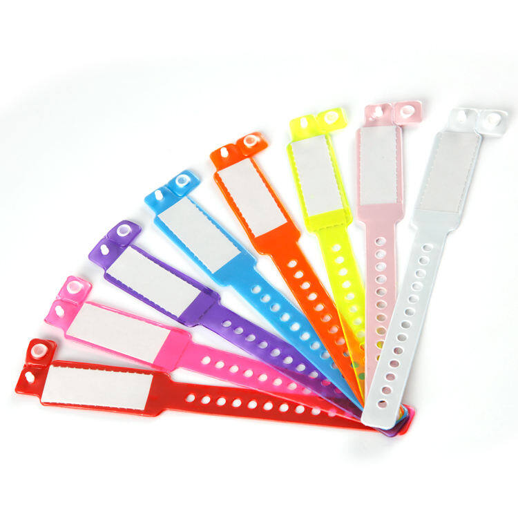
Despite the AHA's efforts, adoption has been uneven. Many facilities continue to use legacy color systems embedded in decades of institutional habit, staff training materials, and supply chain contracts. Some hospitals have added additional colors beyond the AHA's four-band framework to address local needs:
- Cranberry/Maroon: Used by some facilities for "difficult airway" or "bloodborne pathogen" alerts, creating potential confusion with standard red allergy bands.
- Orange: Adopted in some pediatric units for "behavioral health" or "elopement risk," but also used in adult facilities for "isolation" or "infectious disease."
- Teal/Green: Various facilities assign this to "seizure precaution," "diabetic alert," or "MRSA isolation," with no consensus on which meaning takes priority.
- Green: In some neonatal units, green indicates "breastfeeding mother" or "routine care," directly conflicting with other facilities' use of green for "all clear" or "no restrictions."
The Joint Commission has stopped short of mandating a national color standard, instead requiring that hospitals have a defined policy and that staff are trained on it. This deference to local autonomy preserves institutional flexibility but perpetuates the very variation that causes cross-facility errors during patient transfers, disaster responses, and staffing shortages.
The Essential Remedy: Text and Symbols as Safety Redundancy
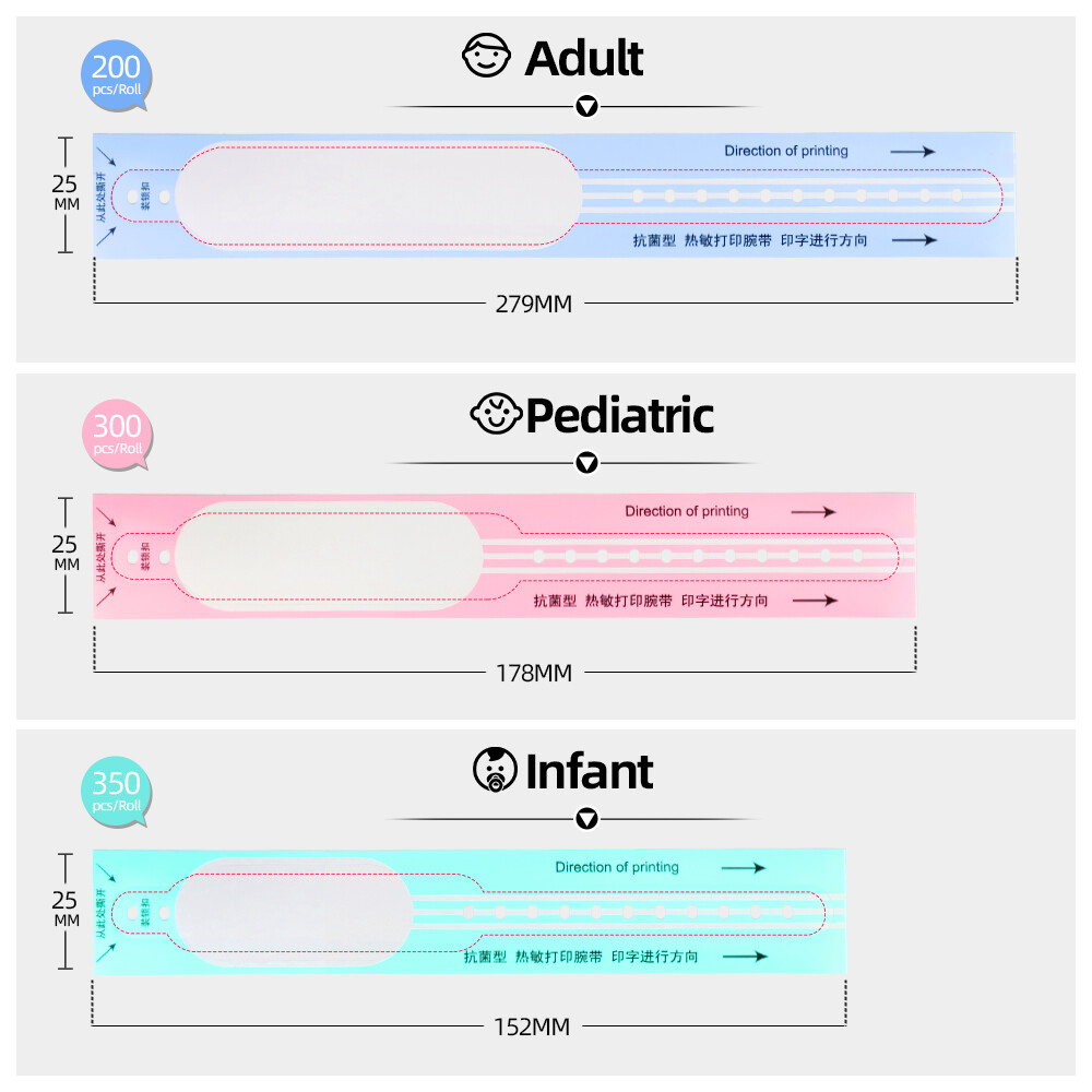
The solution to the limitations of color-only wristband systems is not to abandon color but to demote it. Color should serve as a rapid attention-directing cue—a way to draw the eye to the wristband and signal that important information is present. The actual clinical message must be carried by text and/or standardized symbols that are readable regardless of the observer's color perception, cultural background, or familiarity with a particular facility's protocol.
Evidence That Words Matter
Research in human factors engineering consistently demonstrates that redundant coding—presenting the same information through multiple sensory channels—dramatically reduces error rates. In aviation, cockpit warnings combine color, shape, text, and auditory tones precisely because no single channel is foolproof. Healthcare wristband design should follow the same principle.
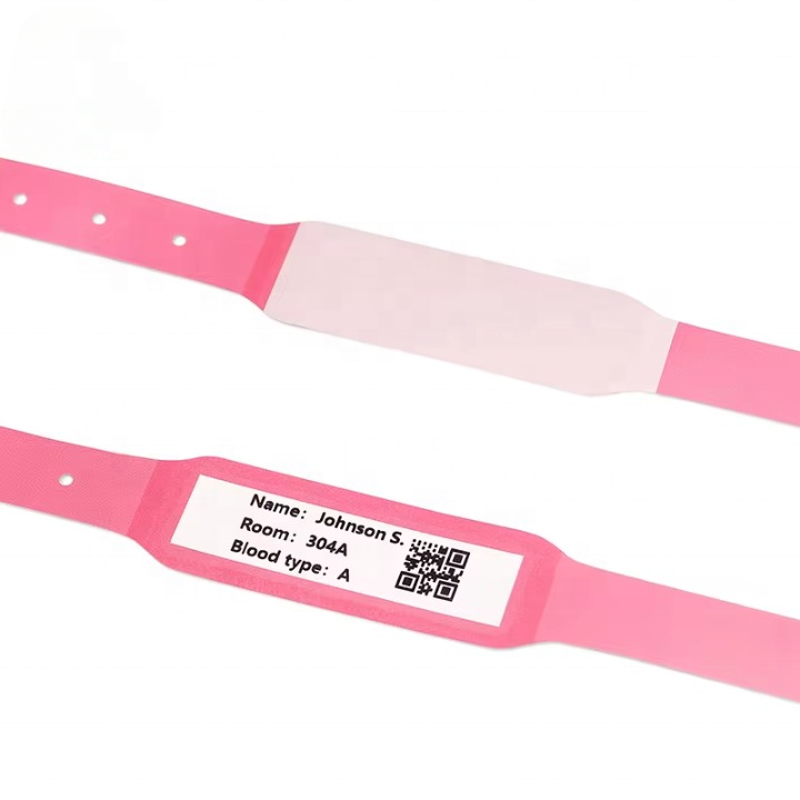
Studies of medication administration errors show that facilities using text-reinforced wristbands experience significantly fewer misidentification events than those relying on color alone. The text need not be extensive—even abbreviated labels like "ALLERGY," "FALL RISK," "DNR," or "NO BP LEFT ARM" provide sufficient redundancy to bridge gaps in color perception and cultural interpretation.
Implementation Recommendations
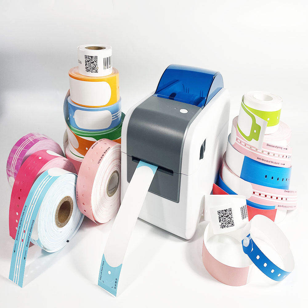
Healthcare organizations seeking to improve wristband safety should consider the following evidence-based practices:
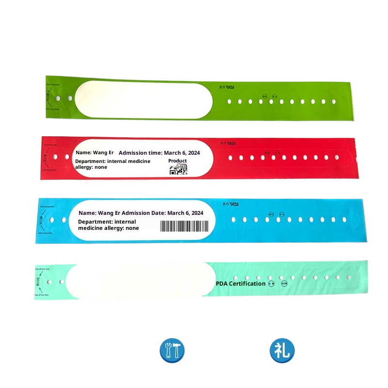
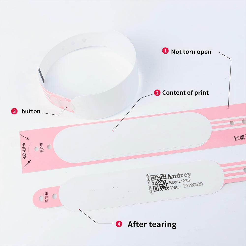
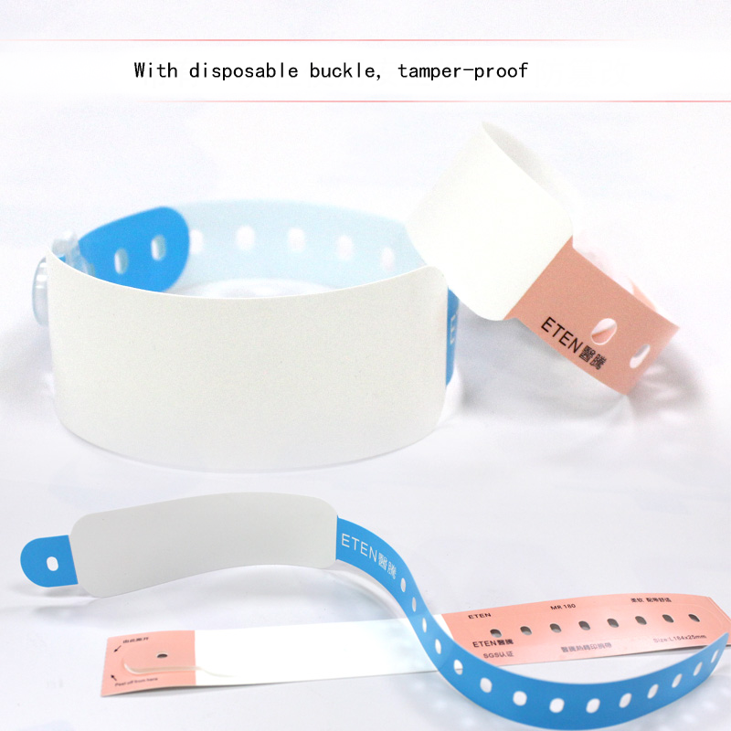
- Mandate text on every alert wristband. Color alone should never be the sole carrier of clinical information. Every wristband must include legible, preprinted text identifying the specific alert condition.
- Adopt standardized abbreviations. Develop a facility-wide glossary of approved wristband text abbreviations to ensure consistency across units and shifts. Avoid ambiguous shorthand that could be misinterpreted.
- Use high-contrast printing. Ensure text is printed in dark ink on a light background (or white ink on a dark background) to maximize readability under varied lighting conditions, including dim night-shift environments.
- Incorporate universal symbols. Supplement text with internationally recognized medical symbols (e.g., the allergy triangle, the fall-risk icon) to provide an additional non-textual cue that transcends language barriers.
- Train all staff on the wristband protocol. Include wristband color and text conventions in orientation, annual competency assessments, and agency/traveler onboarding. Do not assume prior knowledge.
- Audit compliance regularly. Conduct periodic spot checks to verify that wristbands are being applied correctly, that text is legible, and that damaged or faded bands are replaced promptly.
- Engage patients and families. Explain the meaning of wristband colors and text to patients and their families upon admission. An informed patient or family member can serve as an additional safety checkpoint.
- Design for accessibility. Select wristband materials and printing methods that accommodate color-blind staff and patients. Test wristband designs with CVD simulation tools before procurement.
The Singapore Model
Singapore's public hospital system offers a compelling example of successful wristband standardization. The Ministry of Health mandated a limited, nationally consistent color scheme reinforced by mandatory text labels and supported by comprehensive staff training programs:
- White: General patient identification with printed name, NRIC (national ID), and barcode.
- Red: Drug allergy, with preprinted "DRUG ALLERGY" text and space for handwritten allergen specification.
- Yellow: Fall risk, with preprinted "FALL RISK" text and standardized fall-prevention icon.
By limiting the palette to three colors and requiring text reinforcement on every band, Singapore achieved high compliance rates and measurable reductions in wristband-related identification errors. The model demonstrates that standardization is achievable when backed by regulatory authority, adequate resources, and sustained commitment to training.
Conclusion: Color Alone Is Not Enough
Color-coded wristbands emerged from a well-intentioned desire to simplify clinical communication and accelerate recognition of patient safety risks. In an ideal world where every clinician perceived color identically, shared the same cultural framework, worked exclusively within a single facility, and never encountered non-clinical wristbands, a pure color-coding system might suffice.
That world does not exist. Today's healthcare environment is characterized by workforce mobility, cultural diversity, aging infrastructure, and persistent variation in local protocols. Within this reality, color functions best as an attention cue—a fast, peripheral signal that directs the clinician's gaze to the wristband. The actual safety-critical information must be encoded in text and symbols that survive the inevitable variations in human perception and institutional practice.
The path forward is clear: adopt standardized color schemes where possible, but never rely on color alone. Mandate text reinforcement on every alert wristband. Train staff comprehensively and repeatedly. Audit compliance. Engage patients. And above all, recognize that patient safety depends not on the elegance of our visual shortcuts but on the robustness of our redundant safeguards.
The pink trap is not the color itself. It is the assumption that color speaks a universal language. It does not. Our wristband systems must speak in words as well.
This article is intended for informational and educational purposes only and does not constitute medical or legal advice. Healthcare organizations should consult with patient safety experts for guidance on implementing color-coded wristband systems.
Continue Reading
Have Questions About Wristbands?
Our team is ready to help you find the perfect wristband solution for your needs. Contact us directly on WhatsApp for quick responses.
Contact on WhatsApp